ggraph是建立在ggplot2一个扩展R包,结合了igraph和ggplot2的特点为网络图、关系树和系统树等表示关系与层次的数据可视化提供便捷。之前利用igraph绘制网络图已经简单介绍了用igraph绘制网络图,本文通过ggraph简单介绍基于ggplot2的语法绘制网络关系图。
此处我们建一个关系树,一个源节点(origin),延伸10个组(Group),每个分组再分裂10个子节点(subgroup)共计110个点。同时,我们connect数据集根据子节点(subgroup)建立了190条关系网:
# 必要的R包,我们主要用ggraph和igraph绘制节点的网络关系图
library(ggraph)
library(igraph)
library(tidyverse)

# 创建演示数据集
set.seed(2020)
# 创建10个group,并建立层级结构
d1 <-
  data.frame(from = "origin", to = paste("group", seq(1, 10), sep = ""))
d2 <-
  data.frame(from = rep(d1$to, each = 10),
             to = paste("subgroup", seq(1, 100), sep = "_"))
hierarchy <- rbind(d1, d2)

# 建立每个子节点的关联信息
all_leaves <- paste("subgroup", seq(1, 100), sep = "_")
connect <- rbind(
  data.frame(
    from = sample(all_leaves, 100, replace = T) ,
    to = sample(all_leaves, 100, replace = T)
  ),
  data.frame(
    from = sample(head(all_leaves), 30, replace = T) ,
    to = sample(tail(all_leaves), 30, replace = T)
  ),
  data.frame(
    from = sample(all_leaves[25:30], 30, replace = T) ,
    to = sample(all_leaves[55:60], 30, replace = T)
  ),
  data.frame(
    from = sample(all_leaves[75:80], 30, replace = T) ,
    to = sample(all_leaves[55:60], 30, replace = T)
  )
)
# 添加网络对应值大小
connect$value <- runif(nrow(connect))

# 创建数据框,合并主关系网络起止和对应值
vertices  <-  data.frame(name = unique(c(
  as.character(hierarchy$from), as.character(hierarchy$to)
)) ,
value = runif(111))
# 添加Group列,方便后续用颜色来标注不同的点
vertices$group  <-
hierarchy$from[match(vertices$name, hierarchy$to)]数据框建立好后,我们生成一个graph对象,创建我们第一个网络图:
# 创建一个graph对象
mygraph <- graph_from_data_frame(hierarchy, vertices = vertices)

# 关联网络
from  <-  match(connect$from, vertices$name)
to  <-  match(connect$to, vertices$name)


# 绘制关系树圈图
ggraph(mygraph, layout = 'dendrogram', circular = TRUE) +
  geom_conn_bundle(
    data = get_con(from = from, to = to),
    alpha = 0.2,
    colour = "skyblue",
    tension = .5
  ) +
  geom_node_point(aes(
    x = x * 1.05,
    y = y * 1.05
  )) +
  theme_void()
上图我们可以清晰的看到我们所有点的一个排列情况。一般我们构造这样的数据结构是需要看子节点的一个网络关系,origin和group节点为了后续的分组划分展示作用,我们也可以只展示子节点,用如下代码:
# 绘制关系树圈图
ggraph(mygraph, layout = 'dendrogram', circular = TRUE) +
  geom_conn_bundle(
    data = get_con(from = from, to = to),
    alpha = 0.2,
    colour = "skyblue",
    tension = .5
  ) +
  geom_node_point(aes(
    # 只显示子节点
    filter = leaf,
    x = x * 1.05,
    y = y * 1.05
  )) +
  theme_void()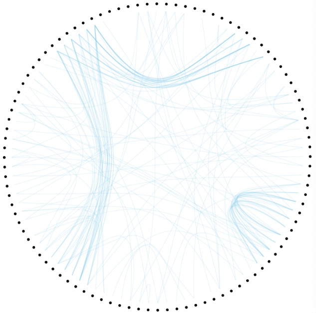
通过geom_node_label添加标签
# 添加标注
ggraph(mygraph, layout = 'dendrogram', circular = TRUE) +
  geom_conn_bundle(
    data = get_con(from = from, to = to),
    alpha = 0.2,
    colour = "skyblue",
    tension = .5
  ) +
  geom_node_point(aes(
    #filter = leaf,
    x = x * 1.05,
    y = y * 1.05
  )) +
  geom_node_label(aes(label = name,
                      # 只显示子节点
                      filter = leaf),
                  position = "identity",
                  label.size = 0.1,
                  repel = F) +
  theme_void()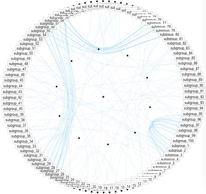
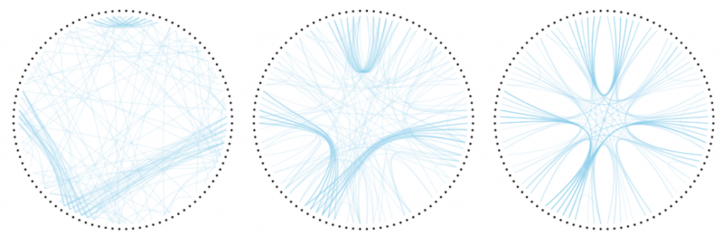
通过tension改变弧度的大小:
p <- ggraph(mygraph, layout = 'dendrogram', circular = TRUE) +
  geom_node_point(aes(
    filter = leaf,
    x = x * 1.05,
    y = y * 1.05
  )) +
  theme_void()

# 0.1
p +  geom_conn_bundle(
  data = get_con(from = from, to = to),
  alpha = 0.2,
  colour = "skyblue",
  width = 0.9,
  tension = 0.1
)
# 0.7
p +  geom_conn_bundle(
  data = get_con(from = from, to = to),
  alpha = 0.2,
  colour = "skyblue",
  width = 0.9,
  tension = 0.7
)
#1
p +  geom_conn_bundle(
  data = get_con(from = from, to = to),
  alpha = 0.2,
  colour = "skyblue",
  width = 0.9,
  tension = 1
)
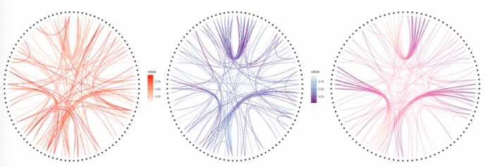
通过value值的大小来改变颜色变化:
p +  geom_conn_bundle(data = get_con(from = from, to = to), aes(colour =
                                                                  value, alpha = value))

p +
  geom_conn_bundle(data = get_con(from = from, to = to), aes(colour = value)) +
  scale_edge_color_continuous(low = "white", high = "red")
p +
  geom_conn_bundle(data = get_con(from = from, to = to), aes(colour = value)) +
  scale_edge_colour_distiller(palette = "BuPu")

p +
  geom_conn_bundle(
    data = get_con(from = from, to = to),
    width = 1,
    alpha = 0.2,
    aes(colour = ..index..)
  ) +
  scale_edge_colour_distiller(palette = "RdPu") +
  theme(legend.position = "none")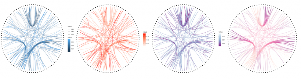
对子节点的每个Group节点分颜色展示:
ggraph(mygraph, layout = 'dendrogram', circular = TRUE) +
  geom_conn_bundle(
    data = get_con(from = from, to = to),
    alpha = 0.2,
    colour = "skyblue",
    tension = .5
  ) +
  geom_node_point(aes(
    # 只显示子节点
    filter = leaf,
    x = x * 1.05,
    y = y * 1.05,
    # 子节点分组颜色展示
    colour = group
  )) +
  theme_void()
简单的应用就介绍到这里了,感兴趣可以研究下方的文档探索更多的功能。
参考资料:
1.https://ggraph.data-imaginist.com/index.html
2.https://www.r-graph-gallery.com/310-custom-hierarchical-edge-bundling.html
