
今天有小伙伴问到共线性图 (或者叫平行图等,当然也可以认为是多个折线图的组合)它的优势是允许比较一组数值变量上的几个个别观测(系列)的特征。每个竖线代表一个变量(单位甚至可以不同)。然后,这些值被绘制成连接在每个轴上的一系列线。
可以用GGally包(ggplot2扩展包,用MASS包也可以)绘制,代码也很简单:
library(ggthemes)
library(dplyr)
library(GGally)


# 演示数据
data <- iris

# 绘图
data %>%
    ggparcoord(
        columns = 1:4,
        groupColumn = 5,
        order = "anyClass",
        # 用于缩放变量的方法
        scale = "robust",
        showPoints = T,
        title = "Parallel plot",
        alphaLines = 0.3
    ) +
    # 设置颜色
    scale_color_manual(values = c("#69b3a2", "grey", "grey")) +
    theme_few() +
    theme(legend.position = "Default",
          plot.title = element_text(size = 10)) +
    xlab("")

对于不同的scale方式,可能图的展示方式不一样,如下:
library(ggthemes)
library(dplyr)
library(GGally)
library(patchwork)


# 演示数据
data <- iris
p1 <- data %>%
    ggparcoord(
        columns = 1:4,
        groupColumn = 5,
        order = "anyClass",
        scale = "globalminmax",
        showPoints = TRUE,
        title = "No scaling",
        alphaLines = 0.3
    ) +
    theme_few() +
    theme(legend.position = "none",
          plot.title = element_text(size = 10)) +
    xlab("")

p2 <- data %>%
    ggparcoord(
        columns = 1:4,
        groupColumn = 5,
        order = "anyClass",
        scale = "uniminmax",
        showPoints = TRUE,
        title = "Standardize to Min = 0 and Max = 1",
        alphaLines = 0.3
    ) +
    theme_few() +
    theme(legend.position = "none",
          plot.title = element_text(size = 10)) +
    xlab("")


p3 <- data %>%
    ggparcoord(
        columns = 1:4,
        groupColumn = 5,
        order = "anyClass",
        scale = "std",
        showPoints = TRUE,
        title = "Normalize univariately (substract mean & divide by sd)",
        alphaLines = 0.3
    ) +
    theme_few() +
    theme(legend.position = "none",
          plot.title = element_text(size = 10)) +
    xlab("")


p4 <- data %>%
    ggparcoord(
        columns = 1:4,
        groupColumn = 5,
        order = "anyClass",
        scale = "center",
        showPoints = TRUE,
        title = "Standardize and center variables",
        alphaLines = 0.3
    ) +
    theme_few() +
    theme(legend.position = "none",
          plot.title = element_text(size = 10)) +
    xlab("")

p1 + p2 + p3 + p4 + plot_layout(ncol = 2)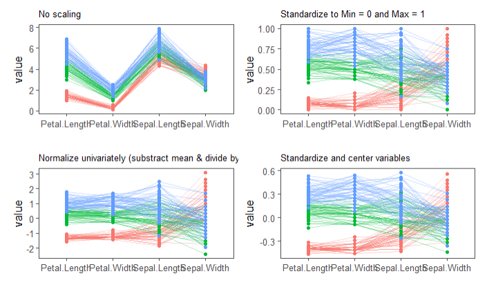
另外一个问题,如何让去除绘图两边的空白呢?利用scale_x_discrete即可,如下:
p1 + scale_x_discrete(expand = c(0,0))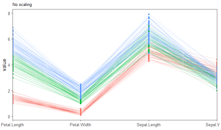
本篇介绍到此结束,欢迎大家留言讨论。
参考资料:
1.https://www.data-to-viz.com/graph/parallel.html

王琛琪
感觉您的这个教程做出来的图很好看, 就想着照着试一试,但是准备表格文件不知道是怎样的呢?
陈浩
试试演示数据