小提琴图是用来展示多组数据的分布状态以及概率密度 。现在生物信息学数据展示最常用的可视化方式之一。
关于小提琴的代码之前已经介绍了很多,大家可以直接通过本站的搜索框搜索。本文直接通过示例绘制分组小提琴绘制,解决大样本数据分析难点。
library(ggplot2)
library(dplyr)
# 来源https://github.com/KPLab/SCS_CAF
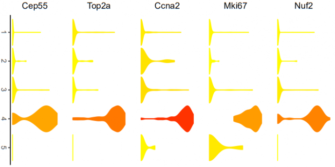
# violin plots represent gene expression for each subpopulation. The color of each violin
# represents the mean gene expression after log2 transformation.
# gene: Gene name of interest as string. DATAuse: Gene expression matrix with rownames containing
# gene names. tsne.popus = dbscan output, axis= if FALSE no axis is printed. legend_position= default "none"
# indicates where legend is plotted. gene_name = if FALSE gene name will not be included in the plot.
plot.violin2 <-
function(gene,
Data,
Group,
axis = FALSE,
legend_position = "none",
gene_name = FALSE) {
testframe <-
data.frame(expression = as.numeric(Data[paste(gene), ]),
Population = Group)
testframe$Population <- as.factor(testframe$Population)
colnames(testframe) <- c("expression", "Population")
col.mean <- vector()
for (i in levels(testframe$Population)) {
col.mean <-
c(col.mean, mean(testframe$expression[which(testframe$Population == i)]))
}
col.mean <- log2(col.mean + 1)
col.means <- vector()
for (i in testframe$Population) {
col.means <- c(col.means, col.mean[as.numeric(i)])
}
testframe$Mean <- col.means
testframe$expression <- log2(testframe$expression + 1)
p <-
ggplot(testframe,
aes(
x = Population,
y = expression,
fill = Mean,
color = Mean
)) +
geom_violin(scale = "width") +
labs(title = paste(gene),
y = "log2(expression)",
x = "Population") +
theme_classic() +
scale_color_gradientn(
colors = c("#FFFF00", "#FFD000", "#FF0000", "#360101"),
limits = c(0, 14)
) +
scale_fill_gradientn(
colors = c("#FFFF00", "#FFD000", "#FF0000", "#360101"),
limits = c(0, 14)
) +
#theme(axis.title.y = element_blank()) +
theme(axis.ticks.y = element_blank()) +
theme(axis.line.y = element_blank()) +
theme(axis.text.y = element_blank()) +
theme(axis.title.x = element_blank()) +
theme(legend.position = legend_position)
if (axis == FALSE) {
p <- p +
theme(
axis.line.x = element_blank(),
axis.text.x = element_blank(),
axis.ticks.x = element_blank()
)
}
if (gene_name == FALSE) {
p <- p + theme(plot.title = element_blank())
} else{
p <- p + theme(plot.title = element_text(size = 10, face = "bold"))
}
p + ylab(gene)
}
# 演示数据
data <- read.csv("data.csv", header = T, row.names = 1)
group <- read.csv("cluster.csv", header = F)$V1
gs <- list(NULL)
gs[[1]] <- plot.violin2(gene = "Nuf2",
Data = data,
Group = group)
gs[[2]] <- plot.violin2(gene = "Mki67",
Data = data,
Group = group)
gs[[3]] <- plot.violin2(gene = "Top2a",
Data = data,
Group = group)
gs[[4]] <- plot.violin2(gene = "Cep55",
Data = data,
Group = group,
axis = T)
# 图片分组
pdf("violin.pdf", width = 3, height = 6)
gridExtra::grid.arrange(grobs=gs,ncol = 1)
dev.off()
参考资料:
1.https://github.com/KPLab/SCS_CAF
