对于Bulk RNA-seq测序(用于比较转录组学,如不同物种的同种组织样本,也就是我们常说的常规转录组测序,注意和单细胞测序区分),我们常用的分析流程有很多,之前的文章也有介绍。偶然在github上发现一个总结的很完整的分析流程和大家分享。
我们依照作者的思路来进行:
- 使用NCBI SRA工具和Python从GEO查找和下载原始数据
- 使用STAR对FASTQ文件进行mapping
- 使用DESeq2进行差异基因表达分析(目前比较常用的像DESeq2、edgeR、limma)
- 对结果的可视化
1)从GEO下载原始数据
# 数据源
# https://www.ncbi.nlm.nih.gov/geo/query/acc.cgi?acc=GSE106305
# 使用SRA工具下载FASTQ文件,linux安装:sudo apt install sra-toolkit
# 下载数据
prefetch SRR7179504
# 将sra文件转换成fastq文件
fastq-dump --outdir fastq --gzip --skip-technical  --readids --read-filter pass --dumpbase --split-3 --clip ~/ncbi/public/sra/SRR7179504.sra
如果我们有多个项目下载,可以用python将上面过程批量化执行:
# python脚本
import subprocess

sra_numbers = [
    "SRR7179504", "SRR7179505", "SRR7179506", "SRR7179507",
    "SRR7179508", "SRR7179509", "SRR7179510", "SRR7179511",
    "SRR7179520", "SRR7179521", "SRR7179522", "SRR7179523",
    "SRR7179524", "SRR7179525", "SRR7179526", "SRR7179527",
    "SRR7179536", "SRR7179537", "SRR7179540","SRR7179541"
    ]

# 下载 .sra 文件到~/ncbi/public/sra/ 目录
for sra_id in sra_numbers:
    print ("Currently downloading: " + sra_id)
    prefetch = "prefetch " + sra_id
    print ("The command used was: " + prefetch)
    subprocess.call(prefetch, shell=True)

# 将sra文件转换成'fastq'文件
for sra_id in sra_numbers:
    print ("Generating fastq for: " + sra_id)
    fastq_dump = "fastq-dump --outdir fastq --gzip --skip-technical  --readids --read-filter pass --dumpbase --split-3 --clip ~/ncbi/public/sra/" + sra_id + ".sra"
    print ("The command used was: " + fastq_dump)
    subprocess.call(fastq_dump, shell=True)
由于每个LNCaP样本都与四个SRA文件关联,对于每个样本,使用命令将四个文件合并为一个FASTQ文件:
# linux cat命令
cat SRR7179504_pass.fastq.gz SRR7179505_pass.fastq.gz SRR7179506_pass.fastq.gz SRR7179507_pass.fastq.gz  > LNCAP_Normoxia_S1.fastq.gz
cat SRR7179508_pass.fastq.gz SRR7179509_pass.fastq.gz SRR7179510_pass.fastq.gz SRR7179511_pass.fastq.gz  > LNCAP_Normoxia_S2.fastq.gz
cat SRR7179520_pass.fastq.gz SRR7179521_pass.fastq.gz SRR7179522_pass.fastq.gz SRR7179523_pass.fastq.gz  > LNCAP_Hypoxia_S1.fastq.gz
cat SRR7179524_pass.fastq.gz SRR7179525_pass.fastq.gz SRR7179526_pass.fastq.gz SRR7179527_pass.fastq.gz  > LNCAP_Hypoxia_S2.fastq.gz
# 修改成真实的文件名,方便后续分析
mv SRR7179536_pass.fastq.gz PC3_Normoxia_S1.fastq.gz
mv SRR7179537_pass.fastq.gz PC3_Normoxia_S2.fastq.gz
mv SRR7179540_pass.fastq.gz PC3_Hypoxia_S1.fastq.gz
mv SRR7179541_pass.fastq.gz PC3_Hypoxia_S2.fastq.gz
至此,原始数据准备已经完成了,下面我们将利用STAR进行比对mapping
2)用STAR进行比对和mapping
首先我们需要建立索引(根据参考基因组)
# 下载索引,从Ensembl网站(https://uswest.ensembl.org/Homo_sapiens/Info/Index)下载FASTA和GTF文件
# linux下用wget来下载
wget ftp://ftp.ensembl.org/pub/release-99/fasta/homo_sapiens/dna/Homo_sapiens.GRCh38.dna.primary_assembly.fa.gz
wget ftp://ftp.ensembl.org/pub/release-99/gtf/homo_sapiens/Homo_sapiens.GRCh38.99.gtf.gz
gunzip *.gz

# 下载完成后,用STAR进行建立索引
STAR --runThreadN 64 --runMode genomeGenerate --genomeDir /data/genomes/h38/STAR/ --genomeFastaFiles /data/genomes/h38/STAR/Homo_sapiens.GRCh38.dna.primary_assembly.fa --sjdbGTFfile /data/genomes/h38/STAR/Homo_sapiens.GRCh38.99.gtf

# 索引建立完成后,我们可以用STAR对fastq文件进行比对,如:
STAR --runThreadN 64 --genomeDir /data/genomes/h38/STAR --outFilterType BySJout --outFilterMismatchNoverLmax 0.04 --outFilterMismatchNmax 999 --alignSJDBoverhangMin 1 --alignSJoverhangMin 8 --outFilterMultimapNmax 20 --alignIntronMin 20 --alignIntronMax 1000000 --alignMatesGapMax 1000000 --readFilesIn /fastq/LNCAP_Normoxia_S1_R1_001.fastq.gz --clip3pAdapterSeq GATCGGAAGAGCACACGTCTGAACTCCAGTCAC --outSAMtype BAM SortedByCoordinate --quantMode GeneCounts --outFileNamePrefix LNCAP_Normoxia_S1

# --genomeDir,包含基因组索引文件的目录
# --readFilesIn,为样本LNCAP_Normoxia_S1_R1_001.fastq.gz指定FASTQ文件位置。
# --outFileNamePrefix,STAR输出的名称
下面我们用python来串联多个fastq文件的比对:
# python脚本
import subprocess
import os

output_directory = "STAR_output/"
genome_directory = "/data/genomes/h38/STAR/"
fastq_directory = "/data/analysis/hypoxia/fastq/"

os.mkdir(output_directory)
for fastq in os.listdir(fastq_directory):
    # only process files that end in fastq.gz
    if fastq.endswith('.fastq.gz'):
        prefix=fastq.strip(".fastq.gz") + "_output"
        # make an output folder for the current fastq file
        os.mkdir(output_directory + prefix)
        print ("Currently mapping: " + fastq)
        # run STAR on the current fastq file
subprocess.call("STAR --runThreadN 64 --genomeDir " + genome_directory + " --readFilesCommand zcat --outFilterType BySJout --outFilterMismatchNoverLmax 0.04 --outFilterMismatchNmax 999 --alignSJDBoverhangMin 1 --alignSJoverhangMin 8 --outFilterMultimapNmax 20 --alignIntronMin 20 --alignIntronMax 1000000 --alignMatesGapMax 1000000 --readFilesIn "+ fastq_directory + fastq + " --clip3pAdapterSeq GATCGGAAGAGCACACGTCTGAACTCCAGTCAC --outSAMtype BAM SortedByCoordinate --quantMode GeneCounts --outFileNamePrefix " + output_directory + prefix + "/", shell=True)脚本运行完成后,应在目录中找到包含每个样本的比对文件的输出文件夹STAR_output,其中ReadsPerGene.out.tab文件包含了我们所需要的每个基因的Reads信息。
下面我们通过python来合并每个fastq文件生成的Reads count统计信息:
# python脚本
import os
import csv

# 根据library kit来修改desired_column数值
desired_column = 3
output_directory = "STAR_output/"
sample_dict = {}
sample_names = []

# 遍历文件夹,读取ReadsPerGene.out.tab至sample_dict
for folder in os.listdir(output_directory):
    if folder.endswith("_output"):
        file_name=folder.strip('_output')
        sample_names.append(file_name)
        gene_dict = {}
        with open(output_directory + folder + "/ReadsPerGene.out.tab") as tabfile:
            print("Column " + str(desired_column) + " of " + file_name + " stored")
            reader = csv.reader(tabfile, delimiter = "\t")
            for row in reader:
                gene_dict[row[0]]=row[desired_column]
        sample_dict[file_name] = gene_dict

# 将sample_dict写入文件
# qc信息存储在qc.csv文件, gene counts are信息存储在raw_counts.csv文件
with open("raw_counts.csv", "wt") as counts_file, open("qc.csv", "wt") as qc_file:
    counts_writer = csv.writer(counts_file)
    qc_writer = csv.writer(qc_file)
    counts_writer.writerow( ['ensembl_id']+ sample_names )
    qc_writer.writerow( ['qc_metric']+ sample_names )
    sorted_genes = sorted(list(sample_dict[sample_names[0]].keys()))
    for gene in sorted_genes:
        output=[gene]
        for sample in sample_names:
            output.append(sample_dict[sample][gene])
        if gene.startswith("N_"):
            qc_writer.writerow(output)
        else:
            counts_writer.writerow(output)
3)使用DESeq2进行差异基因表达分析
得到raw_counts.csv后,我们用DESeq2来进行差异分析:
# R代码
# 官方文档https ://www.bioconductor.org/packages/devel/bioc/vignettes/DESeq2/inst/doc/DESeq2.html
# 安装
if (!requireNamespace("BiocManager", quietly = TRUE))
    install.packages("BiocManager")

BiocManager::install("DESeq2")

# 读取数据
data <- read.csv("raw_counts.csv", header = T, row.names = "ensembl_id")
data <- data[,sort(colnames(data))]

# 创建DESeq2对象
# 创建分组
condition <- c(rep("LNCAP_Hypoxia", 2), rep("LNCAP_Normoxia", 2), rep("PC3_Hypoxia", 2), rep("PC3_Normoxia", 2))
# 通过将单个样本名称(对应于的列名称raw_counts.csv)绑定到数据框内,将它们和分组匹配
my_colData <- as.data.frame(condition)
rownames(my_colData) <- colnames(data)

# 生成DESeq2对象
dds <- DESeqDataSetFromMatrix(countData = data,
                              colData = my_colData,
                              design = ~condition)

# 函数DESeq()将基于负二项式分布执行差异表达分析
dds <- DESeq(dds)
# 对count进行normalize
normalized_counts <- counts(dds, normalized = T)

# 添加注释信息
# 可以从Ensembl BioMart http://uswest.ensembl.org/biomart/martview/下载
annotation <- read.csv("GRCh38.p13_annotation.csv", header = T, stringsAsFactors = F)
normalized_counts <- rownames_to_column(as.data.frame(normalized_counts), var = "ensembl_id")
annotated_data <- right_join(annotation, normalized_counts, by = c("Gene.stable.ID" = "ensembl_id"))

# 输出
write.csv(annotated_data, file = "gene_annotated_normalized_counts.csv")
样本质控,查看组内组间的是否存在异常值
# R代码
# 对数据进行方差稳定化转换vst()
vsd <- vst(dds, blind = TRUE)
# 聚类分析
plotDists = function (vsd.obj) {
  sampleDists <- dist(t(assay(vsd.obj)))
  sampleDistMatrix <- as.matrix( sampleDists )
  rownames(sampleDistMatrix) <- paste( vsd.obj$condition )
  colors <- colorRampPalette( rev(RColorBrewer::brewer.pal(9, "Blues")) )(255)
  pheatmap::pheatmap(sampleDistMatrix,
           clustering_distance_rows = sampleDists,
           clustering_distance_cols = sampleDists,
           col = colors)
}
plotDists(vsd)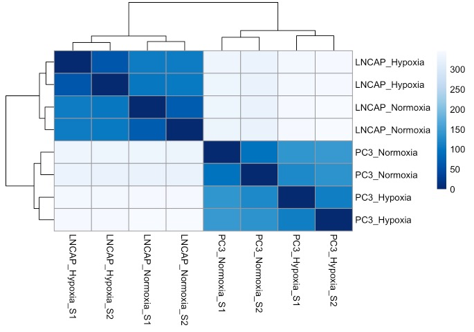
# R代码
# 通过选择具有最高rowVars()值的基因来获得样本中变化最大的基因
# 仅根据样本之间的变异性选择基因,没有进行统计检验以确定两组之间是否确实存在显着差异
variable_gene_heatmap <- function (vsd.obj, num_genes = 500, annotation, title = "") {
  brewer_palette <- "RdBu"
  # Ramp the color in order to get the scale.
  ramp <- colorRampPalette( RColorBrewer::brewer.pal(11, brewer_palette))
  mr <- ramp(256)[256:1]
  # get the stabilized counts from the vsd object
  stabilized_counts <- assay(vsd.obj)
  # calculate the variances by row(gene) to find out which genes are the most variable across the samples.
  row_variances <- rowVars(stabilized_counts)
  # get the top most variable genes
  top_variable_genes <- stabilized_counts[order(row_variances, decreasing=T)[1:num_genes],]
  # subtract out the means from each row, leaving the variances for each gene
  top_variable_genes <- top_variable_genes - rowMeans(top_variable_genes, na.rm=T)
  # replace the ensembl ids with the gene names
  gene_names <- annotation$Gene.name[match(rownames(top_variable_genes), annotation$Gene.stable.ID)]
  rownames(top_variable_genes) <- gene_names
  # reconstruct colData without sizeFactors for heatmap labeling
  coldata <- as.data.frame(vsd.obj@colData)
  coldata$sizeFactor <- NULL
  # draw heatmap using pheatmap
  pheatmap::pheatmap(top_variable_genes, color = mr, annotation_col = coldata, fontsize_col = 8, fontsize_row = 250/num_genes, border_color = NA, main = title)
}

variable_gene_heatmap(vsd, num_genes = 40, annotation = annotation)
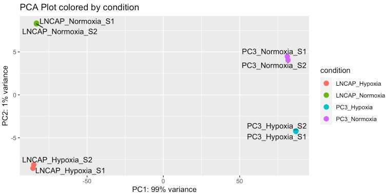
# R代码
# 主成分分析,查看组间差异,是否存在异常样本
plot_PCA = function (vsd.obj) {
  pcaData <- plotPCA(vsd.obj,  intgroup = c("condition"), returnData = T)
  percentVar <- round(100 * attr(pcaData, "percentVar"))
  ggplot(pcaData, aes(PC1, PC2, color=condition)) +
    geom_point(size=3) +
    labs(x = paste0("PC1: ",percentVar[1],"% variance"),
         y = paste0("PC2: ",percentVar[2],"% variance"),
         title = "PCA Plot colored by condition") +
    ggrepel::geom_text_repel(aes(label = name), color = "black")
}
plot_PCA(vsd)
# R代码
# 因为数据中的许多变异是由于细胞系背景的差异所致,所以我们必须为LNcaP和PC3样本创建单独的DESeq2对象
generate_DESeq_object <- function (my_data, groups) {
  data_subset1 <- my_data[,grep(str_c("^", groups[1]), colnames(my_data))]
  data_subset2 <- my_data[,grep(str_c("^", groups[2]), colnames(my_data))]
  my_countData <- cbind(data_subset1, data_subset2)
  condition <- c(rep(groups[1],ncol(data_subset1)), rep(groups[2],ncol(data_subset2)))
  my_colData <- as.data.frame(condition)
  rownames(my_colData) <- colnames(my_countData)
  print(my_colData)
  dds <- DESeqDataSetFromMatrix(countData = my_countData,
                              colData = my_colData,
                              design = ~ condition)
  dds <- DESeq(dds, quiet = T)
  return(dds)
}
# 选择分组
lncap <- generate_DESeq_object(data, c("LNCAP_Hypoxia", "LNCAP_Normoxia"))
pc3 <- generate_DESeq_object(data, c("PC3_Hypoxia", "PC3_Normoxia"))
# 同样,我们用热图来展示两种条件下都富集的基因
lncap_vsd <- vst(lncap, blind = T)
pc3_vsd <- vst(pc3, blind = T)
a <- variable_gene_heatmap(lncap_vsd, 30, annotation = annotation, title = "LNCaP variable genes")
b <- variable_gene_heatmap(pc3_vsd, 30, annotation = annotation, title = "PC3 variable genes")
# 图片拼接
gridExtra::grid.arrange(a[[4]],b[[4]], nrow = 1)
我们已经评估了样品之间的差异性,并确信我们的实验已正确执行,下面进行差异分析:
# R代码
# 从DESeq2对象中提取差异表达的基因
results(lncap, contrast = c("condition", "LNCAP_Hypoxia", "LNCAP_Normoxia"))
# 创建generate_DE_results()执行多个过滤步骤并以csv文件形式提供输出的函数
generate_DE_results <- function (dds, comparisons, padjcutoff = 0.001, log2cutoff = 0.5, cpmcutoff = 2) {
  # generate average counts per million metric from raw count data
  raw_counts <- counts(dds, normalized = F)
  cpms <- enframe(rowMeans(edgeR::cpm(raw_counts)))
  colnames(cpms) <- c("ensembl_id", "avg_cpm")

  # extract DESeq results between the comparisons indicated
  res <- results(dds, contrast = c("condition", comparisons[1], comparisons[2]))[,-c(3,4)]

  # annotate the data with gene name and average counts per million value
  res <- as_tibble(res, rownames = "ensembl_id")
  # read in the annotation and append it to the data
  my_annotation <- read.csv("GRCh38.p13_annotation.csv", header = T, stringsAsFactors = F)
  res <- left_join(res, my_annotation, by = c("ensembl_id" = "Gene.stable.ID"))
  # append the average cpm value to the results data
  res <- left_join(res, cpms, by = c("ensembl_id" = "ensembl_id"))

  # combine normalized counts with entire DE list
  normalized_counts <- round(counts(dds, normalized = TRUE),3)
  pattern <- str_c(comparisons[1], "|", comparisons[2])
  combined_data <- as_tibble(cbind(res, normalized_counts[,grep(pattern, colnames(normalized_counts))] ))
  combined_data <- combined_data[order(combined_data$log2FoldChange, decreasing = T),]

  # make ordered rank file for GSEA, selecting only protein coding genes
  res_prot <- res[which(res$Gene.type == "protein_coding"),]
  res_prot_ranked <- res_prot[order(res_prot$log2FoldChange, decreasing = T),c("Gene.name", "log2FoldChange")]
  res_prot_ranked <- na.omit(res_prot_ranked)
  res_prot_ranked$Gene.name <- str_to_upper(res_prot_ranked$Gene.name)

  # generate sorted lists with the indicated cutoff values
  res <- res[order(res$log2FoldChange, decreasing=TRUE ),]
  de_genes_padj <- res[which(res$padj < padjcutoff),]
  de_genes_log2f <- res[which(abs(res$log2FoldChange) > log2cutoff & res$padj < padjcutoff),]
  de_genes_cpm <- res[which(res$avg_cpm > cpmcutoff & res$padj < padjcutoff),]

  # write output to files
  write.csv (de_genes_padj, file = paste0(comparisons[1], "_vs_", comparisons[2], "_padj_cutoff.csv"), row.names =F)
  write.csv (de_genes_log2f, file = paste0(comparisons[1], "_vs_", comparisons[2], "_log2f_cutoff.csv"), row.names =F)
  write.csv (de_genes_cpm, file = paste0(comparisons[1], "_vs_", comparisons[2], "_cpm_cutoff.csv"), row.names =F)
  write.csv (combined_data, file = paste0(comparisons[1], "_vs_", comparisons[2], "_allgenes.csv"), row.names =F)
  write.table (res_prot_ranked, file = paste0(comparisons[1], "_vs_", comparisons[2], "_rank.rnk"), sep = "\t", row.names = F, quote = F)

  writeLines( paste0("For the comparison: ", comparisons[1], "_vs_", comparisons[2], ", out of ", nrow(combined_data), " genes, there were: \n",
               nrow(de_genes_padj), " genes below padj ", padjcutoff, "\n",
               nrow(de_genes_log2f), " genes below padj ", padjcutoff, " and above a log2FoldChange of ", log2cutoff, "\n",
               nrow(de_genes_cpm), " genes below padj ", padjcutoff, " and above an avg cpm of ", cpmcutoff, "\n",
               "Gene lists ordered by log2fchange with the cutoffs above have been generated.") )
  gene_count <- tibble (cutoff_parameter = c("padj", "log2fc", "avg_cpm" ),
                        cutoff_value = c(padjcutoff, log2cutoff, cpmcutoff),
                        signif_genes = c(nrow(de_genes_padj), nrow(de_genes_log2f), nrow(de_genes_cpm)))
  invisible(gene_count)
}

# 提取差异基因
lncap_output <- generate_DE_results (lncap, c("LNCAP_Hypoxia", "LNCAP_Normoxia"))
pc3_output <- generate_DE_results(pc3, c("PC3_Hypoxia", "PC3_Normoxia"))
4)结果可视化
对差异结果可视化展示:
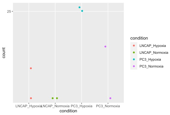
# R代码
# 对单个基因的count可视化展示
d <- plotCounts(dds, gene="ENSG00000146678", intgroup="condition", returnData=TRUE)

ggplot(d, aes(x=condition, y=count)) +
  geom_point(position=position_jitter(w=0.1,h=0), aes (color = condition)) +
  scale_y_log10(breaks=c(25,100,400))
# R代码
# 用基因名称来绘图
plot_counts <- function (dds, gene, normalization = "DESeq2"){
  # read in the annotation file
  annotation <- read.csv("GRCh38.p13_annotation.csv", header = T, stringsAsFactors = F)
  # obtain normalized data
  if (normalization == "cpm") {
    normalized_data <- cpm(counts(dds, normalized = F)) # normalize the raw data by counts per million
  } else if (normalization == "DESeq2")
    normalized_data <- counts(dds, normalized = T) # use DESeq2 normalized counts
  # get sample groups from colData
  condition <- dds@colData$condition
  # get the gene name from the ensembl id
  if (is.numeric(gene)) { # check if an index is supplied or if ensembl_id is supplied
    if (gene%%1==0 )
      ensembl_id <- rownames(normalized_data)[gene]
    else
      stop("Invalid index supplied.")
  } else if (gene %in% annotation$Gene.name){ # check if a gene name is supplied
    ensembl_id <- annotation$Gene.stable.ID[which(annotation$Gene.name == gene)]
  } else if (gene %in% annotation$Gene.stable.ID){
    ensembl_id <- gene
  } else {
    stop("Gene not found. Check spelling.")
  }
  expression <- normalized_data[ensembl_id,]
  gene_name <- annotation$Gene.name[which(annotation$Gene.stable.ID == ensembl_id)]
  # construct a tibble with the grouping and expression
  gene_tib <- tibble(condition = condition, expression = expression)
  ggplot(gene_tib, aes(x = condition, y = expression))+
    geom_boxplot(outlier.size = NULL)+
    geom_point()+
    labs (title = paste0("Expression of ", gene_name, " - ", ensembl_id), x = "group", y = paste0("Normalized expression (", normalization , ")"))+
    theme(axis.text.x = element_text(size = 11), axis.text.y = element_text(size = 11))
}

plot_counts(dds, "IGFBP1")
绘制差异基因热图:
# R代码
res <- read.csv ("LNCAP_Hypoxia_vs_LNCAP_Normoxia_allgenes.csv", header = T)

DE_gene_heatmap <- function(res, padj_cutoff = 0.0001, ngenes = 20) {
  # generate the color palette
  brewer_palette <- "RdBu"
  ramp <- colorRampPalette(RColorBrewer::brewer.pal(11, brewer_palette))
  mr <- ramp(256)[256:1]
  # obtain the significant genes and order by log2FoldChange
  significant_genes <- res %>% filter(padj < padj_cutoff) %>% arrange (desc(log2FoldChange)) %>% head (ngenes)
  heatmap_values <- as.matrix(significant_genes[,-c(1:8)])
  rownames(heatmap_values) <- significant_genes$Gene.name
  # plot the heatmap using pheatmap
  pheatmap::pheatmap(heatmap_values, color = mr, scale = "row", fontsize_col = 10, fontsize_row = 200/ngenes, fontsize = 5, border_color = NA)
}
DE_gene_heatmap(res, 0.001, 30)
火山图绘制:
# R代码
res <- read.csv ("LNCAP_Hypoxia_vs_LNCAP_Normoxia_allgenes.csv", header = T)

plot_volcano <- function (res, padj_cutoff, nlabel = 10, label.by = "padj"){
  # assign significance to results based on padj
  res <- mutate(res, significance=ifelse(res$padj<padj_cutoff, paste0("padj < ", padj_cutoff), paste0("padj > ", padj_cutoff)))
  res = res[!is.na(res$significance),]
  significant_genes <- res %>% filter(significance == paste0("padj < ", padj_cutoff))

  # get labels for the highest or lowest genes according to either padj or log2FoldChange
  if (label.by == "padj") {
    top_genes <- significant_genes %>% arrange(padj) %>% head(nlabel)
    bottom_genes <- significant_genes %>% filter (log2FoldChange < 0) %>% arrange(padj) %>% head (nlabel)
  } else if (label.by == "log2FoldChange") {
    top_genes <- head(arrange(significant_genes, desc(log2FoldChange)),nlabel)
    bottom_genes <- head(arrange(significant_genes, log2FoldChange),nlabel)
  } else
    stop ("Invalid label.by argument. Choose either padj or log2FoldChange.")

  ggplot(res, aes(log2FoldChange, -log(padj))) +
    geom_point(aes(col=significance)) +
    scale_color_manual(values=c("red", "black")) +
    ggrepel::geom_text_repel(data=top_genes, aes(label=head(Gene.name,nlabel)), size = 3)+
    ggrepel::geom_text_repel(data=bottom_genes, aes(label=head(Gene.name,nlabel)), color = "#619CFF", size = 3)+
    labs ( x = "Log2FoldChange", y = "-(Log normalized p-value)")+
    geom_vline(xintercept = 0, linetype = "dotted")+
    theme_minimal()
}

plot_volcano(res, 0.0005, nlabel = 15, label.by = "padj")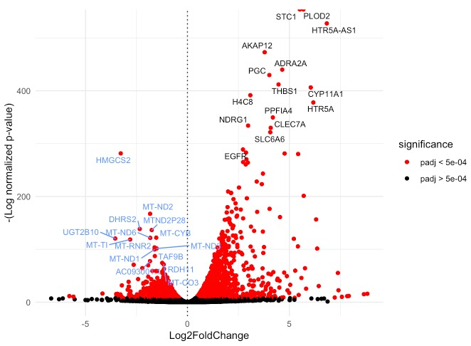
绘制LogFoldChange对比图:
# R代码
res1 <- read.csv ("LNCAP_Hypoxia_vs_LNCAP_Normoxia_allgenes.csv", header = T)
res2 <- read.csv ("PC3_Hypoxia_vs_PC3_Normoxia_allgenes.csv", header = T)

compare_significant_genes <- function (res1, res2, padj_cutoff=0.0001, ngenes=250, nlabel=10, samplenames=c("comparison1", "comparison2"), title = "" ) {
  # get list of most upregulated or downregulated genes for each results table
  genes1 <- rbind(head(res1[which(res1$padj < padj_cutoff),], ngenes), tail(res1[which(res1$padj < padj_cutoff),], ngenes))
  genes2 <- rbind(head(res2[which(res2$padj < padj_cutoff),], ngenes), tail(res2[which(res2$padj < padj_cutoff),], ngenes))

   # combine the data from both tables
  de_union <- union(genes1$ensembl_id,genes2$ensembl_id)
  res1_union <- res1[match(de_union, res1$ensembl_id),][c("ensembl_id", "log2FoldChange", "Gene.name")]
  res2_union <- res2[match(de_union, res2$ensembl_id),][c("ensembl_id", "log2FoldChange", "Gene.name")]
  combined <- left_join(res1_union, res2_union, by = "ensembl_id", suffix = samplenames )

  # identify overlap between genes in both tables
  combined$de_condition <- 1 # makes a placeholder column
  combined$de_condition[which(combined$ensembl_id %in% intersect(genes1$ensembl_id,genes2$ensembl_id))] <- "Significant in Both"
  combined$de_condition[which(combined$ensembl_id %in% setdiff(genes1$ensembl_id,genes2$ensembl_id))] <- paste0("Significant in ", samplenames[1])
  combined$de_condition[which(combined$ensembl_id %in% setdiff(genes2$ensembl_id,genes1$ensembl_id))] <- paste0("Significant in ", samplenames[2])
  combined[is.na(combined)] <- 0

  # find the top most genes within each condition to label on the graph
  label1 <- rbind(head(combined[which(combined$de_condition==paste0("Significant in ", samplenames[1])),],nlabel),
                  tail(combined[which(combined$de_condition==paste0("Significant in ", samplenames[1])),],nlabel))
  label2 <- rbind(head(combined[which(combined$de_condition==paste0("Significant in ", samplenames[2])),],nlabel),
                  tail(combined[which(combined$de_condition==paste0("Significant in ", samplenames[2])),],nlabel))
  label3 <- rbind(head(combined[which(combined$de_condition=="Significant in Both"),],nlabel),
                  tail(combined[which(combined$de_condition=="Significant in Both"),],nlabel))
  combined_labels <- rbind(label1,label2,label3)

  # plot the genes based on log2FoldChange, color coded by significance
  ggplot(combined, aes_string(x = paste0("log2FoldChange", samplenames[1]), y = paste0("log2FoldChange", samplenames[2]) )) +
      geom_point(aes(color = de_condition), size = 0.7)+
      scale_color_manual(values= c("#00BA38", "#619CFF", "#F8766D"))+
      ggrepel::geom_text_repel(data= combined_labels, aes_string(label=paste0("Gene.name", samplenames[1]), color = "de_condition"), show.legend = F, size=3)+
      geom_vline(xintercept = c(0,0), size = 0.3, linetype = 2)+
      geom_hline(yintercept = c(0,0), size = 0.3, linetype = 2)+
      labs(title = title,x = paste0("log2FoldChange in ", samplenames[1]), y = paste0("log2FoldChange in ", samplenames[2]))+
      theme_minimal()+
      theme(legend.title = element_blank())
}

compare_significant_genes(res1,res2, samplenames = c("LNCaP", "PC3"), title = "Hypoxia-induced gene expression differences in LNCaP vs PC3 cells") 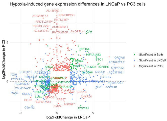
接下来是进行富集分析,我们用fgsea包进行分析:
# R代码
# 安装
if (!requireNamespace("BiocManager", quietly = TRUE))
install.packages("BiocManager")
BiocManager::install("fgsea")
# 下载library:可以从https ://www.gsea-msigdb.org/gsea/msigdb/collections.jsp下载
library(fgsea)
# 数据准备
# read in file containing lists of genes for each pathway
hallmark_pathway <- gmtPathways("h.all.v7.0.symbols.gmt.txt")
# load the ranked list
lncap_ranked_list <- read.table("LNCAP_Hypoxia_vs_LNCAP_Normoxia_rank.rnk", header = T, stringsAsFactors = F)
# formats the ranked list for the fgsea() function
prepare_ranked_list <- function(ranked_list) {
# if duplicate gene names present, average the values
if( sum(duplicated(ranked_list$Gene.name)) > 0) {
ranked_list <- aggregate(.~Gene.name, FUN = mean, data = ranked_list)
ranked_list <- ranked_list[order(ranked_list$log2FoldChange, decreasing = T),]
}
# omit rows with NA values
ranked_list <- na.omit(ranked_list)
# turn the dataframe into a named vector
ranked_list <- tibble::deframe(ranked_list)
ranked_list
}
lncap_ranked_list <- prepare_ranked_list(lncap_ranked_list)
# generate GSEA results table using fgsea() by inputting the pathway list and ranked list
fgsea_results <- fgsea(pathways = hallmark_pathway,
stats = lncap_ranked_list,
minSize = 15,
maxSize = 500,
nperm= 1000)
# 绘制条形图
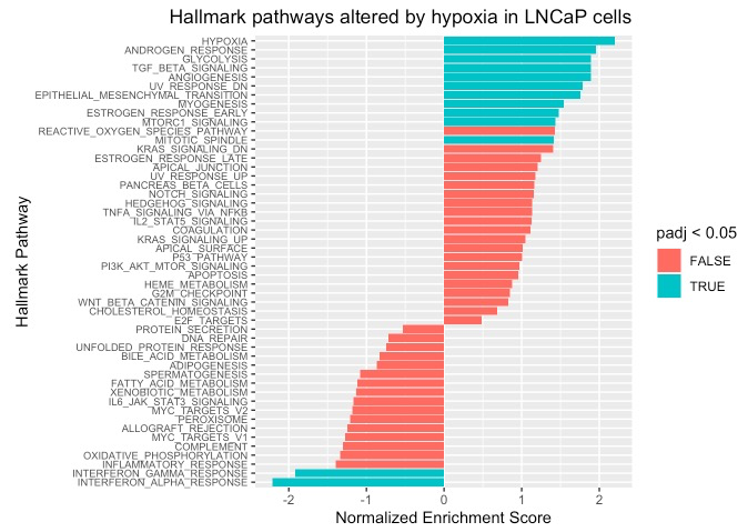
waterfall_plot <- function (fsgea_results, graph_title) {
fgsea_results %>%
mutate(short_name = str_split_fixed(pathway, "_",2)[,2])%>% # removes 'HALLMARK_' from the pathway title
ggplot( aes(reorder(short_name,NES), NES)) +
geom_bar(stat= "identity", aes(fill = padj<0.05))+
coord_flip()+
labs(x = "Hallmark Pathway", y = "Normalized Enrichment Score", title = graph_title)+
theme(axis.text.y = element_text(size = 7),
plot.title = element_text(hjust = 1))
}
waterfall_plot(fgsea_results, "Hallmark pathways altered by hypoxia in LNCaP cells")
# R代码
# 绘制“富集曲线”
# wrapper for fgsea::plotEnrichment()
plot_enrichment <- function (geneset, pathway, ranked_list) {
  plotEnrichment(geneset[[pathway]], ranked_list)+labs (title = pathway)
}
# example of positively enriched pathway (up in Hypoxia)
plot_enrichment(hallmark_pathway, "HALLMARK_GLYCOLYSIS" , lncap_ranked_list)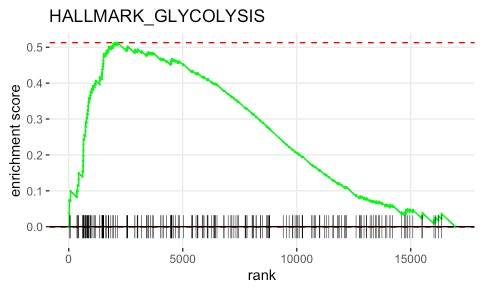
以上就是常规转录组的整个分析流程了(基于STAR,当然也有基于Hisat2、tophat2等等,但是整体思路都是一样),以上内容供学习参考。
参考资料:
1.https://erilu.github.io/bulk-rnaseq-analysis/
