一般来说我们用直角坐标系绘制像常见的柱状图、散点图等,但是遇见分组或者分类很多的数据展示的时候,我们的直角坐标系的图像可视化就显的不是那么简洁和美观了。这时我们用极坐标展示会大大的节省空间,另外总体展示也是很美观的,下面以一个简单的图例介绍如何用ggplot2绘制极坐标图形的方法。
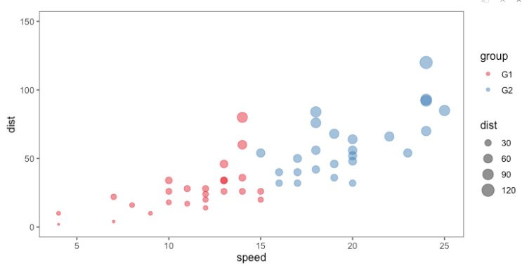
在ggplot2中,我们用coord_polar功能绘制极坐标图形,像常见的柱状图、散点图都可以用来绘制极坐标图,以一个简单的散点图转换为例:
利用极坐标转换后的图形代码和结果如下:
library(ggplot2)
library(ggthemes)

# 使用演示数据
data(cars)

cars$group <- c(rep("G1", 25), rep("G2", 25))
cars$id=seq(1, nrow(cars))

ggplot(cars, aes(
  x = speed,
  y = dist,
  size = dist,
  colour = group
)) +
  geom_point(alpha = .5) +
  # 使散点的面积正比与变量值
  scale_size_area() +
  # 标尺函数:palette设置配色方案
  scale_colour_brewer(palette = "Set1") +
  # 极坐标系
  coord_polar(theta = "x") +
  # 调整中心位置,防止点聚集在一起
  ylim(-50,150) +
  annotate(
    "text",
    x = rep(0, 4),
    y = c(0, 50, 100, 150),
    label = c("0", "50", "100", "150") ,
    color = "black",
    size = 3 ,
    angle = 0,
    fontface = "bold",
    hjust = 1
  ) +
  theme_void() +
  theme(
    axis.title = element_blank(),
    panel.grid = element_line(colour = "grey"),
    # 不显示x轴线
    panel.grid.major.x = element_blank(),
    panel.grid.minor.x = element_blank()
  ) +
  # 加两个指示圈
  geom_segment(
    aes(
      x = 0,
      y = -10,
      xend = 15,
      yend = -10
    ),
    colour = "#E41A1C",
    alpha = 0.5,
    size = 0.6 ,
    inherit.aes = FALSE
  ) +
  geom_segment(
    aes(
      x = 16,
      y = -10,
      xend = 24,
      yend = -10
    ),
    colour = "#377EB8",
    alpha = 0.5,
    size = 0.6 ,
    inherit.aes = FALSE
  ) +
  # 添加标签
  geom_text(
    aes(x = 7, y = -25, label = "G1"),
    colour = "black",
    alpha = 0.8,
    size = 3,
    fontface = "bold",
    inherit.aes = FALSE
  ) +
  geom_text(
    aes(x = 20, y = -25, label = "G2"),
    colour = "black",
    alpha = 0.8,
    size = 3,
    fontface = "bold",
    inherit.aes = FALSE
  )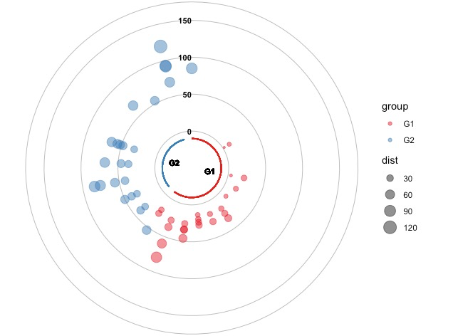
本案例仅做展示,是选择那种坐标系绘制,主要依据你的数据结构,不能一概而论!
参考资料:
1.https://www.data-to-viz.com/graph/circularbarplot.html
