前面一篇已经简单介绍了坡度图的绘制,如下:
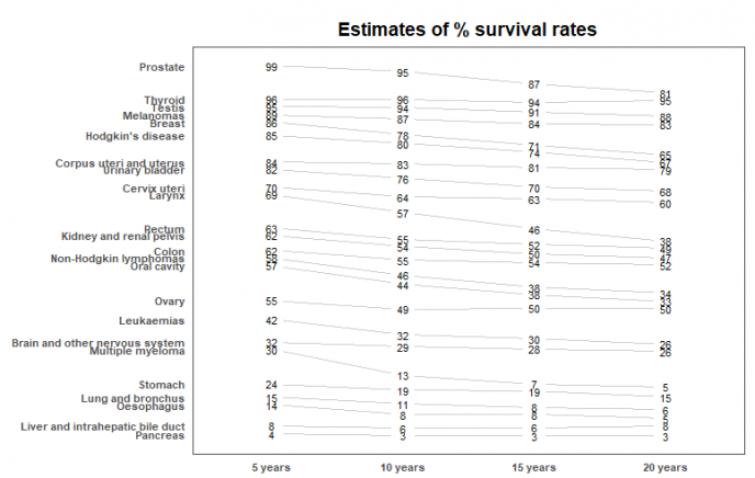
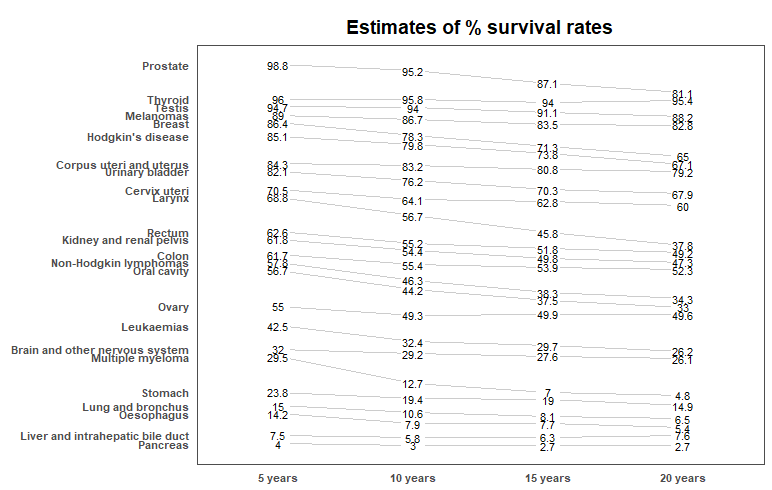
本篇以一个进阶版的示例展示坡度图的应用,我们使用一个关于不同癌种的生存率来做演示,原始数据:
library(ggplot2)
library(ggthemes)
library(dplyr)

# 设置主题
theme_set(theme_few())

# 示例数据
source_df <- read.csv("cancer_survival_rates.csv")

# 参考https://github.com/jkeirstead/r-slopegraph

# 数据预处理函数
tufte_sort <-
    function(df,
             x = "year",
             y = "value",
             group = "group",
             method = "tufte",
             min.space = 0.05) {
        # 重新定义列名
        ids <- match(c(x, y, group), names(df))
        df <- df[, ids]
        names(df) <- c("x", "y", "group")

        # 去报每个组都有对应的值
        tmp <- expand.grid(x = unique(df$x), group = unique(df$group))
        tmp <- merge(df, tmp, all.y = TRUE)
        df <- mutate(tmp, y = ifelse(is.na(y), 0, y))

        # 生成一个matrix,并按照第一列排序
        require(reshape2)
        tmp <- dcast(df, group ~ x, value.var = "y")
        ord <- order(tmp[, 2])
        tmp <- tmp[ord, ]

        min.space <- min.space * diff(range(tmp[, -1]))
        yshift <- numeric(nrow(tmp))
        # 以下计算执行对y轴缩放
        for (i in 2:nrow(tmp)) {
            mat <- as.matrix(tmp[(i - 1):i, -1])
            d.min <- min(diff(mat))
            yshift[i] <- ifelse(d.min < min.space, min.space - d.min, 0)
        }


        tmp <- cbind(tmp, yshift = cumsum(yshift))

        scale <- 1
        tmp <-
            melt(
                tmp,
                id = c("group", "yshift"),
                variable.name = "x",
                value.name = "y"
            )
        # 将其存储在ypos中,缩放方式: ypos = a*yshift + y

        tmp <- transform(tmp, ypos = y + scale * yshift)
        return(tmp)

    }

# 定义绘图函数
plot_slopegraph <- function(df) {
    ylabs <- subset(df, x == head(x, 1))$group
    yvals <- subset(df, x == head(x, 1))$ypos
    fontSize <- 3
    gg <- ggplot(df, aes(x = x, y = ypos)) +
        geom_line(aes(group = group), colour = "grey80") +
        geom_point(colour = "white", size = 8) +
        geom_text(aes(label = y), size = fontSize) +
        scale_y_continuous(name = "",
                           breaks = yvals,
                           labels = ylabs)
    return(gg)
}

# 数据处理
df <- tufte_sort(
    source_df,
    x = "year",
    y = "value",
    group = "group",
    method = "tufte",
    min.space = 0.05
)

df <- transform(df,
                x = factor(
                    x,
                    levels = c(5, 10, 15, 20),
                    labels = c("5 years", "10 years", "15 years", "20 years")
                ),
                y = y #round(y)
                )

# 绘图
plot_slopegraph(df) + labs(title = "Estimates of % survival rates") +
    theme(
        axis.title = element_blank(),
        axis.ticks = element_blank(),
        plot.title = element_text(
            hjust = 0.5,
            face = "bold"
        ),
        axis.text = element_text(face = "bold", size = 8)
    )
参考资料:
1.https://github.com/jkeirstead/r-slopegraph

张芳菲
代码不方便复制
陈浩
你好,推荐自己动手操作,文章代码仅仅做演示。