
ggpmisc也是ggplot2的扩展包(或者说是ggplot2生态圈中的一份子),它可以方便的展示诸如直线回归、并添加回归方程、方差分析表等等一些操作,极大的方便了R绘图效率。
# 安装
install.packages("ggpmisc")
下面挑选部分经典案例做一个简单介绍:
# 一下示例基于下面R包,如果需要模仿示例运行,请酌情安装
library(dplyr)
library(ggplot2)
library(ggthemes)
library(ggpmisc)
library(ggrepel)
library(xts)
library(lubridate)
library(tibble)
library(nlme)
1)时间序列绘图:
# lynx自带演示数据
ggplot(lynx, as.numeric = FALSE) + geom_line() +
    stat_peaks(colour = "red") +
    stat_peaks(
        geom = "text",
        colour = "red",
        vjust = -0.5,
        check_overlap = TRUE
    ) +
    theme_few() +
    ylim(-100, 7300)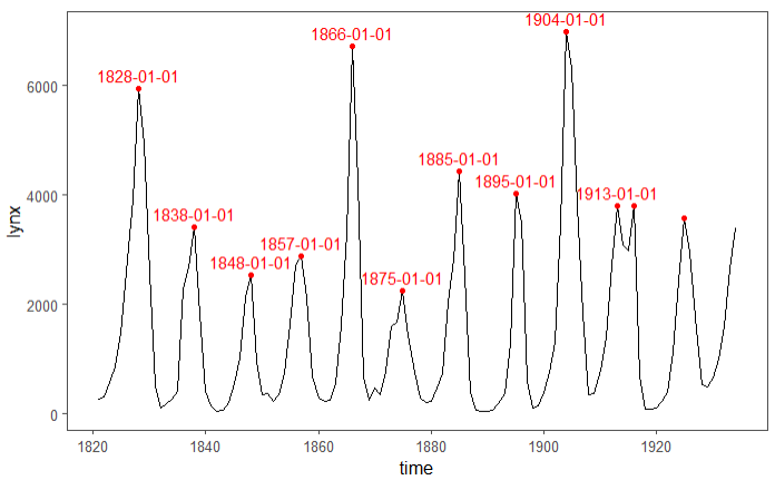
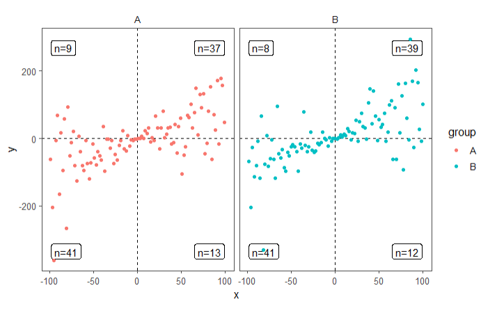
2)象限统计分面图:
set.seed(2020)
# 生成演示数据
x <- -99:100
y <- x + rnorm(length(x), mean = 0, sd = abs(x))
my.data <- data.frame(x,
                      y,
                      group = c("A", "B"))
ggplot(my.data, aes(x, y, colour = group)) +
    geom_quadrant_lines() +
    stat_quadrant_counts(geom = "label_npc") +
    geom_point() +
    expand_limits(y = c(-260, 260)) +
    theme_few() +
    facet_wrap( ~ group)
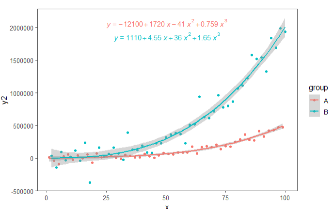
3)回归方程+拟合线
set.seed(2020)
# 演示数据
x <- 1:100
y <-
    (x + x ^ 2 + x ^ 3) + rnorm(length(x), mean = 0, sd = mean(x ^ 3) / 4)
my.data <- data.frame(
    x,
    y,
    group = c("A", "B"),
    y2 = y * c(0.5, 2),
    block = c("a", "a", "b", "b"),
    wt = sqrt(x)
)


formula <- y ~ poly(x, 3, raw = TRUE)
ggplot(my.data, aes(x, y2, colour = group)) +
    geom_point() +
    geom_smooth(method = "lm", formula = formula) +
    theme_few() +
    stat_poly_eq(
        aes(label = stat(eq.label)),
        formula = formula,
        parse = TRUE,
        label.x = "centre"
    )
set.seed(2020)
# 演示数据
x <- 1:100
y <-
    (x + x ^ 2 + x ^ 3) + rnorm(length(x), mean = 0, sd = mean(x ^ 3) / 4)
my.data <- data.frame(
    x,
    y,
    group = c("A", "B"),
    y2 = y * c(0.5, 2),
    block = c("a", "a", "b", "b"),
    wt = sqrt(x)
)

formula <- y ~ poly(x, 3, raw = TRUE)
ggplot(my.data, aes(x, y2, colour = group, fill = block)) +
    geom_point(shape = 21, size = 3) +
    geom_smooth(method = "lm", formula = formula) +
    stat_poly_eq(
        aes(label = stat(rr.label)),
        size = 3,
        alpha = 0.2,
        geom = "label_npc",
        label.y = c(0.95, 0.85, 0.95, 0.85),
        formula = formula,
        parse = TRUE
    ) +
    theme_few() +
    facet_wrap( ~ group, scales = "free_y")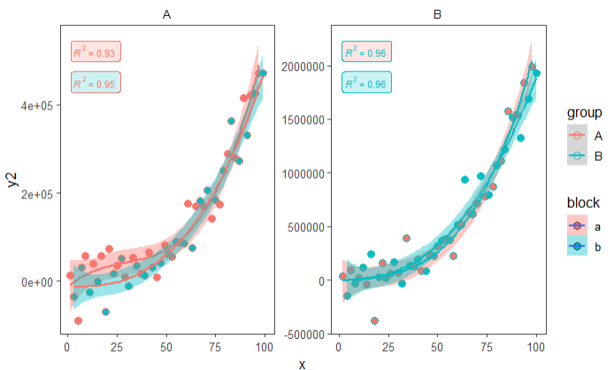
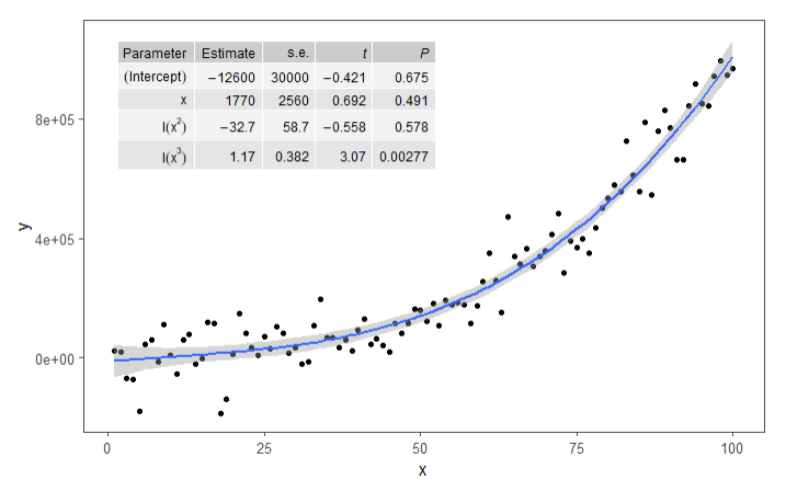
4)添加方差分析表
set.seed(2020)
# 演示数据
x <- 1:100
y <-
    (x + x ^ 2 + x ^ 3) + rnorm(length(x), mean = 0, sd = mean(x ^ 3) / 4)
my.data <- data.frame(
    x,
    y,
    group = c("A", "B"),
    y2 = y * c(0.5, 2),
    block = c("a", "a", "b", "b"),
    wt = sqrt(x)
)

formula <- y ~ x + I(x ^ 2) + I(x ^ 3)
ggplot(my.data, aes(x, y)) +
    geom_point() +
    geom_smooth(method = "lm", formula = formula) +
    theme_few() +
    stat_fit_tb(
        method = "lm",
        method.args = list(formula = formula),
        tb.vars = c(
            Parameter = "term",
            Estimate = "estimate",
            "s.e." = "std.error",
            "italic(t)" = "statistic",
            "italic(P)" = "p.value"
        ),
        label.y = "top",
        label.x = "left",
        parse = TRUE
    )
5)数据加标注等
random_string <- function(len = 6) {
    paste(sample(letters, len, replace = TRUE), collapse = "")
}

# 演示数据
set.seed(2020)
d <- tibble::tibble(
    x = rnorm(100),
    y = rnorm(100),
    group = rep(c("A", "B"), c(50, 50)),
    lab = replicate(100, {
        random_string()
    })
)

ggplot(data = d, aes(x + rep(c(-2, 2), rep(50, 2)),
                     y, colour = group)) +
    theme_few() +
    geom_point() +
    stat_dens2d_filter(shape = 1,
                       size = 3,
                       keep.fraction = 0.25)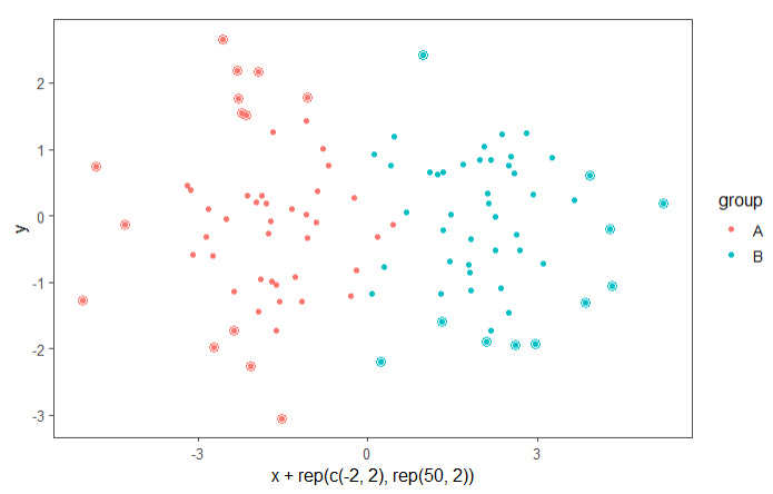
ggplot(data = d, aes(x, y, label = lab, colour = group)) +
    geom_point() +
    theme_few() +
    stat_dens2d_filter(geom = "text_repel", keep.fraction = 0.5)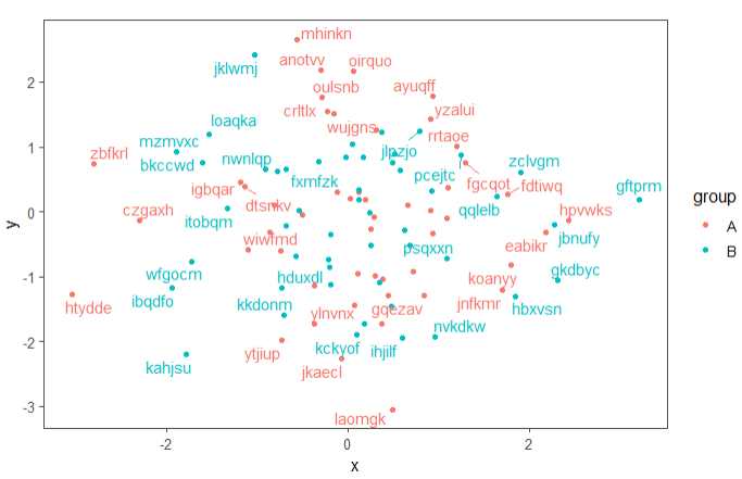
6)还能画火山图
volcano_example.df %>%
    mutate(., outcome.fct = outcome2factor(outcome)) %>%
    ggplot(., aes(logFC, PValue, colour = outcome.fct)) +
    geom_point() +
    scale_x_logFC(name = "Transcript abundance%unit") +
    scale_y_Pvalue() +
    scale_colour_outcome() +
    theme_few() +
    stat_quadrant_counts(data = . %>% filter(outcome != 0))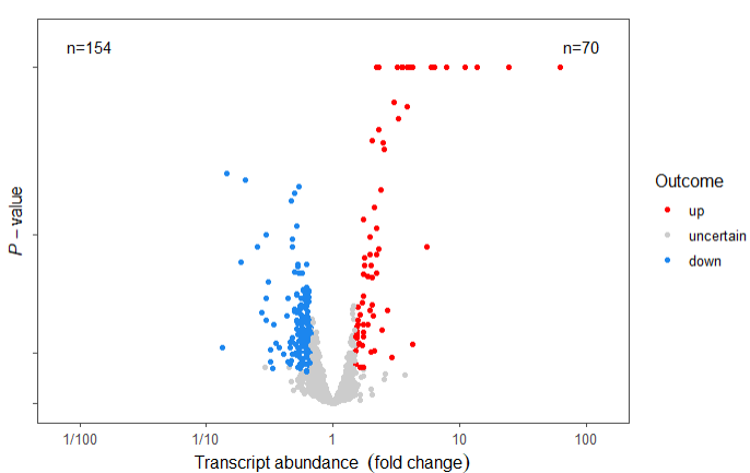
总体感觉此包功能上还是蛮全面的,也做了很多个性化的设置,以上就是此包的主要一些功能介绍本文旨在抛砖引玉,更多详细的内容请大家查看官方文档。
参考资料:
1.https://docs.r4photobiology.info/ggpmisc/index.html
