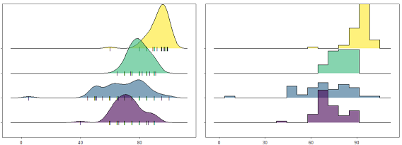
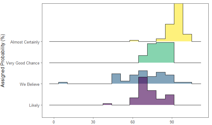
山峦图主要用来显示数组的数值分布情况,可以用直方图或密度图来表示,下面我们演示如何用R绘制两种形式的山峦图:
示例数据:
示例代码:
# 需要用到的包
library(tidyverse)
library(ggthemes)
library(viridis)
library(ggridges)

# 加载演示数据
data <- read.table("probly.csv", header = TRUE, sep = ",")

# 数据过滤筛选
data <- data %>%
  gather(key = "text", value = "value") %>%
  mutate(text = gsub("\\.", " ", text)) %>%
  mutate(value = round(as.numeric(value), 0)) %>%
  filter(
    text %in% c(
      "Almost Certainly",
      "Very Good Chance",
      "We Believe",
      "Likely"
    )
  )

# 绘制密度曲线-山峦图
data %>%
  mutate(text = fct_reorder(text, value)) %>%
  ggplot(aes(y = text, x = value,  fill = text)) +
  geom_density_ridges(alpha = 0.6,
                      bandwidth = 4,
                      jittered_points = TRUE,
                      # 在密度图下方加上数据线
                      position = position_points_jitter(width = 0.05, height = 0),
                      point_shape = '|',
                      point_size = 3,
                      point_alpha = 1) +
  scale_fill_viridis(discrete = TRUE) +
  scale_color_viridis(discrete = TRUE) +
  # 主题定制
  theme_few() +
  theme(
    legend.position = "none",
    panel.spacing = unit(0.1, "lines"),
    strip.text.x = element_text(size = 8)
  ) +
  xlab("") +
  ylab("Assigned Probability (%)")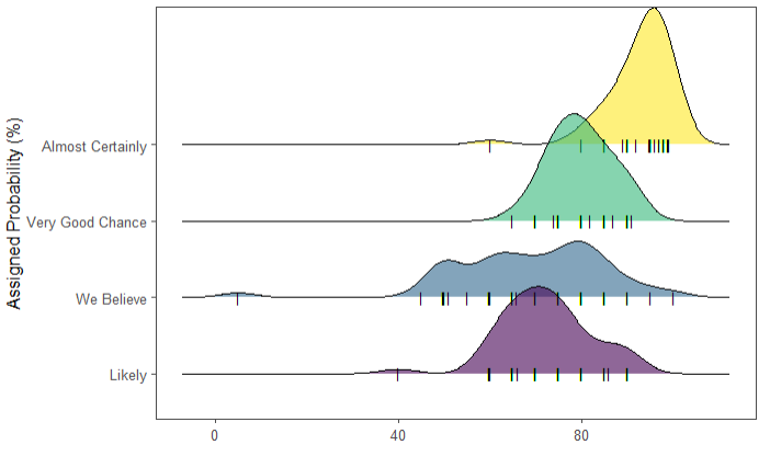
# 绘制直方图-山峦图

data %>%
  mutate(text = fct_reorder(text, value)) %>%
  ggplot( aes(y=text, x=value,  fill=text)) +
    # 直方图
    geom_density_ridges(alpha=0.6,
                        stat="binline",
                        bins=15,
                        draw_baseline=T) +
    scale_fill_viridis(discrete=TRUE) +
    scale_color_viridis(discrete=TRUE) +
    theme_few() +
    theme(
      legend.position="none",
      panel.spacing = unit(0.1, "lines"),
      strip.text.x = element_text(size = 8)
    ) +
    xlab("") +
    ylab("Assigned Probability (%)")
官方文档也给出了很多示例,如果你感兴趣请访问:https://cran.r-project.org/web/packages/ggridges/vignettes/introduction.html
参考文章:
1.https://www.data-to-viz.com/graph/ridgeline.html
