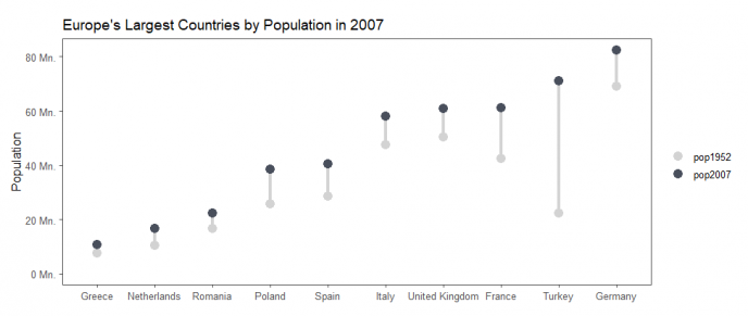
用R绘制科研图片我们常用ggplot2这样的R包,但是我们调整图片需要花费大量的时间。ggcharts就是一个可以缩短你与ggplot2数据可视化的距离的R包,绘图总体来说很方便,下面我们以一个哑铃图简单做演示:
library(ggcharts)
library(ggthemes)

# 加载演示数据
data("popeurope")

# 绘制棒棒图/哑铃图
dumbbell_chart(
  data = popeurope,
  x = country,
  y1 = pop1952,
  y2 = pop2007,
  top_n = 10,
  horizontal = F,
  point_colors = c("lightgray", "#494F5C")
) +
  theme_few()+
  # 定制坐标轴
  labs(
    x = NULL,
    y = "Population",
    title = "Europe's Largest Countries by Population in 2007"
  ) +
  # 设置Y轴标签
  scale_y_continuous(
    limits = c(0, NA),
    labels = function(x) paste(x, "Mn.")
  )
参考资料:
1.https://thomas-neitmann.github.io/ggcharts/index.html
