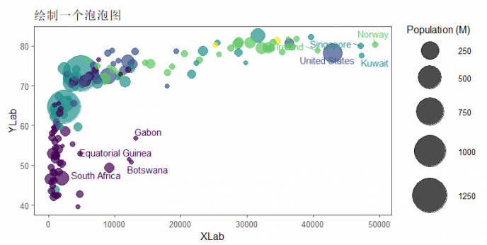
泡泡图(bubble chart)是可用于同时展示三个变量之间的关系。它与散点图类似,绘制时将一个变量放在横轴,另一个变量放在纵轴,而第三个变量则用气泡的大小来表示,在同一张图上呈现更多的信息。
下面我们通过一个示例来学习如何用R绘制一个泡泡图:
# 加载包
library(tidyverse)
library(ggthemes)
library(viridis)
library(gridExtra)
library(ggrepel)

# 加载演示数据
library(gapminder)
data <- gapminder %>% filter(year == "2007") %>% dplyr::select(-year)

# 添加标签
tmp <- data %>%
  mutate(
    annotation = case_when(
      gdpPercap > 5000 & lifeExp < 60 ~ "yes",
      lifeExp < 30 ~ "yes",
      gdpPercap > 40000 ~ "yes"
    )
  ) %>%
  mutate(pop = pop / 1000000) %>%
  arrange(desc(pop)) %>%
  mutate(country = factor(country, country))


# 绘图
data %>%
  mutate(pop = pop / 1000000) %>%
  arrange(desc(pop)) %>%
  mutate(country = factor(country, country)) %>%
  ggplot(aes(
    x = gdpPercap,
    y = lifeExp,
    size = pop,
    color = continent
  )) +
  geom_point(alpha = 0.7) +
  # 泡泡绘图size从1.4到19
  scale_size(range = c(2, 20), name = "Population (M)") +
  scale_color_viridis(discrete = TRUE, guide = FALSE) +
  # 主题选择,此处用ggthemes主题
  theme_few() +
  # 在右侧显示图例
  theme(legend.position = "right") +
  # 选择性添加标签
  geom_text_repel(data = tmp %>% filter(annotation == "yes"),
                  aes(label = country),
                  size = 4) +
  xlab("XLab") +
  ylab("YLab") +
  ggtitle("题目:绘制一个泡泡图")
如此一个漂亮的泡泡图就绘制好了。
参考资料:
1.https://www.data-to-viz.com/graph/bubble.html
