
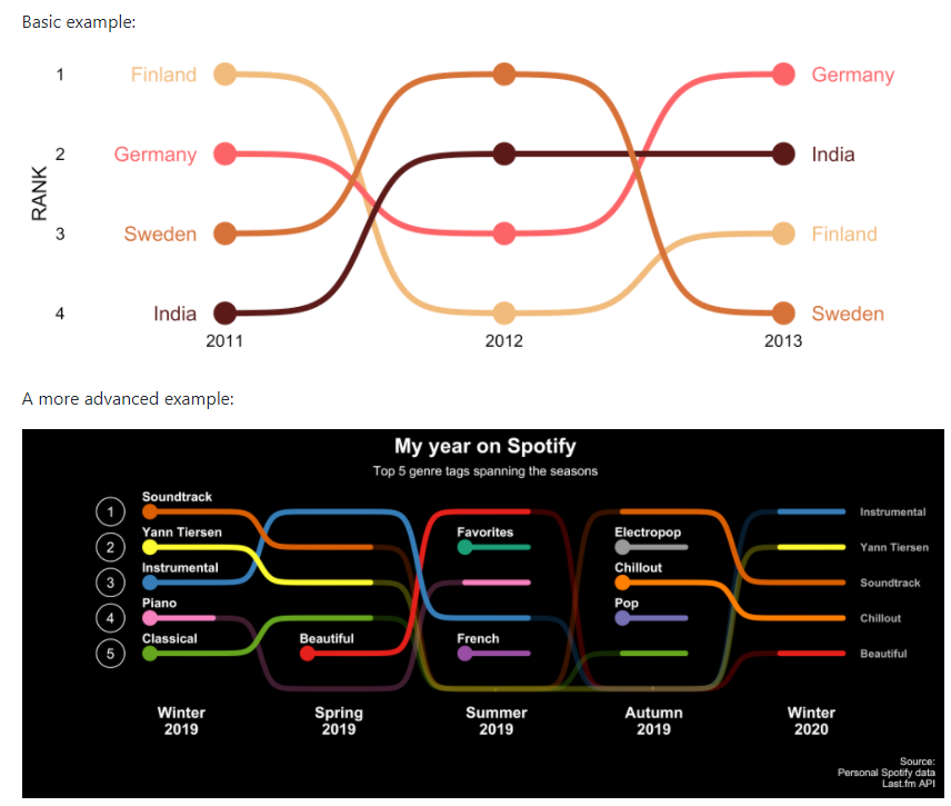
Bump charts(是一种经典的图表,有称之为凹凸图),ggbump是目前用的比较多的一个R包用来绘制Bump charts,也是ggplot2家族成员。凹凸图可以很直观的看出一个变量的变化趋势,常用于作不同类别的趋势变化图表。作者也给出了大量的示例:
首先我们先安装ggbump,方式如下:
install.packages("ggbump")
# 或者安装最新开发版
devtools::install_github("davidsjoberg/ggbump")
接下来我们根据作者提供的案例牛刀小试:
# pacman主要用来自动安装和加载包的一款管理软件
if(!require(pacman)) install.packages("pacman")
library(ggbump)
pacman::p_load(tidyverse, cowplot, wesanderson, ggthemes)

# 创建测试数据
df <- tibble(country = c("India", "India", "India", "Sweden", "Sweden", "Sweden", "Germany", "Germany", "Germany", "Finland", "Finland", "Finland"),
             year = c(2011, 2012, 2013, 2011, 2012, 2013, 2011, 2012, 2013, 2011, 2012, 2013),
             value = c(492, 246, 246, 369, 123, 492, 246, 369, 123, 123, 492, 369))
然后我们对数据集进行一个排序
df <- df %>%
  group_by(year) %>%
  mutate(rank = rank(value, ties.method = "random")) %>%
  ungroup()
# 绘图
ggplot(df, aes(year, rank, color = country)) +
    geom_bump() + theme_few()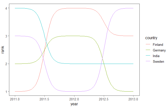
当然我们也可以设计的更加精美一点:
ggplot(df, aes(year, rank, color = country)) +
  # 定义点的大小
  geom_point(size = 7) +
  # 文本标注
  geom_text(data = df %>% filter(year == min(year)),
            aes(x = year - .1, label = country), size = 5, hjust = 1) +
  geom_text(data = df %>% filter(year == max(year)),
            aes(x = year + .1, label = country), size = 5, hjust = 0) +
  # 绘制凹凸线,如上图
  geom_bump(size = 2, smooth = 8) +
  # 坐标轴、颜色等配置
  scale_x_continuous(limits = c(2010.6, 2013.4),
                     breaks = seq(2011, 2013, 1)) +
  theme_minimal_grid(font_size = 14, line_size = 0) +
  theme(legend.position = "none",
        panel.grid.major = element_blank()) +
  labs(y = "RANK",
       x = NULL) +
  scale_y_reverse() +
  scale_color_manual(values = wes_palette(n = 4, name = "GrandBudapest1"))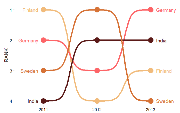
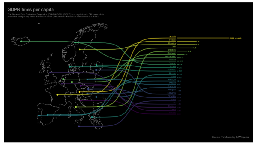
作者github提供了很多案例,感兴趣的朋友可以访问下面网页学习。
参考资料:
1.https://github.com/davidsjoberg/ggbump
