formattable是一个利用html元素进行图表可视化的一个R包。
下面我们用一个转录组的数据做演示,利用Rstudio创建一R markdown文件formattable.Rmd,内容如下:
---
title: "定制你的基因报告"
author: "CH"
date: "`r format(Sys.time(), '%d %B, %Y')`"
output:
html_document
---
```{r include=FALSE}
#加载包
library(data.table)
library(dplyr)
library(formattable)
library(DT)
library(airway)
library(magrittr)
library(DESeq2)
# 加载演示数据
data("airway")
airway$dex %<>% relevel("untrt")
# 定义颜色
customGreen0 = "#DeF7E9"
customGreen = "#71CA97"
customRed = "#ff7f7f"
```
```{r include=FALSE}
# DESeq2计算差异
dds <- DESeqDataSet(airway, design = ~ cell + dex)
dds <- DESeq(dds, betaPrior = FALSE)
res1 <- results(dds, contrast = c("dex", "trt", "untrt"))
res1 <-
lfcShrink(dds,
contrast = c("dex", "trt", "untrt"),
res = res1)
res2 <- results(dds, contrast = c("cell", "N061011", "N61311"))
res2 <-
lfcShrink(dds,
contrast = c("cell", "N061011", "N61311"),
res = res2) %>% as.data.frame()
res2$log2FoldChange <- round(res2$log2FoldChange, digits = 2)
res3 <- res2[which(abs(res2$log2FoldChange) > 1),]
```
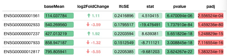
```{r echo=FALSE}
# 创建箭头
log2FoldChange_formatter <- formatter("span",
style = x ~ style(
font.weight = "bold",
color = ifelse(x > 0, customGreen, ifelse(x < 0, customRed, "black"))
),
x ~ icontext(ifelse(x >= 1, "arrow-up", ifelse(x <= -1, "arrow-down", "")), x))
# 展示表单
formattable(
res2[1:100,],
align = c("l", "c", "c", "c", "c", "c", "r"),
list(
`Indicator Name` = formatter("span", style = ~ style(
color = "grey", font.weight = "bold"
)),
`baseMean` = color_tile(customGreen, customGreen0),
`lfcSE` = color_tile(customGreen, customGreen0),
`stat` = color_tile(customGreen, customGreen0),
`pvalue` = color_tile(customGreen, customGreen0),
`padj` = color_bar(customRed),
`log2FoldChange` = log2FoldChange_formatter
)
)
```
然后我们点击Knit生成网页版报告,最终我们可以看到表单展示效果如下:
参考资料:
1.https://www.littlemissdata.com/blog/pretty-r-tables-in-github
2.https://github.com/renkun-ken/formattable
