热图作为一个很常见的数据展现形式,之前的文章也介绍过用pheatmap、heatmap.2等等R包都可以简单绘制,本文主要运用ggplot2绘制热图。
library(ggplot2)
library(ggthemes)
library(reshape2)
library(dplyr)
library(RColorBrewer)
# 选取颜色
palette <-
colorRampPalette(rev(brewer.pal(10, 'RdYlGn')), space = 'Lab')
# 计算相关矩阵
data_cor <- cor(iris[, 1:4]) %>% melt()
# 保留2位有效数字
data_cor$value <- round( data_cor$value, digits = 2)
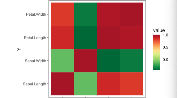
# ggplot2绘制热图
ggplot(data = data_cor, aes(x = Var1, y = Var2, fill = value)) +
geom_tile() +
coord_equal() +
scale_fill_gradientn(colours = palette(90)) +
xlab("X") +
ylab("Y") +
theme_few() +
theme(axis.text.x = element_text(
vjust = 0.5,
hjust = 0.5,
angle = 90
)) +
# 添加值标注
geom_text(aes(Var1, Var2, label = value),
color = "black",
size = 3)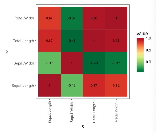
用ggplot2绘制的一个简单的热图就绘制完成了,更多的元素可以参考ggplot2的一些配置。
参考资料:
1.https://www.guru99.com/r-k-means-clustering.html
