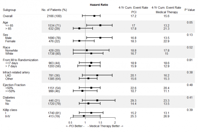
森林图(forestplot),主要是以统计指标和统计分析方法为基础,用数值运算结果绘制出的图型, 广泛用于Meta分析、或者展示临床信息 。
现在使用比较多的是用 forestplot 绘制,下面参考 r-bloggers 的一篇文章为例,介绍森林图的绘制方法。
# 安装
install.packages("forestplot")
准备数据:
接下来我们利用 forestplot 绘制 森林图,代码如下:
library(forestplot)

# 载入数据
data <- read.csv("forestplotdata.csv", stringsAsFactors = FALSE)

# 子标签缩进2个字符
subgps <- c(4, 5, 8, 9, 12, 13, 16, 17, 20, 21, 24, 25, 28, 29, 32, 33)
data$Variable[subgps] <- paste("  ", data$Variable[subgps])

# 合并统计数和百分比
np <-
    ifelse(!is.na(data$Count),
           paste(data$Count, " (", data$Percent, ")", sep = ""),
           NA)

# 定义表头
tabletext <- cbind(
    c("Subgroup", "\n", data$Variable),
    c("No. of Patients (%)", "\n", np),
    c("4-Yr Cum. Event Rate\n PCI", "\n", data$PCI.Group),
    c(
        "4-Yr Cum. Event Rate\n Medical Therapy",
        "\n",
        data$Medical.Therapy.Group
    ),
    c("P Value", "\n", data$P.Value)
)
# 绘图

png("Forestplot.png", width = 960, height = 640)
forestplot(
    # 定义表头
    labeltext = tabletext,
    # 图像元素相对位置,也可以用“right”、“left”定义
    graph.pos = 3,
    # 均值
    mean = c(NA, NA, data$Point.Estimate),
    # 置信区间
    lower = c(NA, NA, data$Low),
    upper = c(NA, NA, data$High),
    # 图像标题
    title = "Hazard Ratio",
    # X轴
    xlab = "     <- PCI Better -    - Medical Therapy Better ->",
    # 根据子类的位置,设置大类的线类型、背景颜色等信息
    hrzl_lines = list(
        "3" = gpar(lwd = 1, col = "#99999922"),
        "7" = gpar(
            lwd = 60,
            lineend = "butt",
            columns = c(2:6),
            col = "#99999922"
        ),
        "15" = gpar(
            lwd = 60,
            lineend = "butt",
            columns = c(2:6),
            col = "#99999922"
        ),
        "23" = gpar(
            lwd = 60,
            lineend = "butt",
            columns = c(2:6),
            col = "#99999922"
        ),
        "31" = gpar(
            lwd = 60,
            lineend = "butt",
            columns = c(2:6),
            col = "#99999922"
        )
    ),
    # 设置字体、文字大小等信息
    txt_gp = fpTxtGp(
        label = gpar(cex = 1.25),
        ticks = gpar(cex = 1.1),
        xlab = gpar(cex = 1.2),
        title = gpar(cex = 1.2)
    ),
    # 颜色设置
    col = fpColors(box = "black", lines = "black", zero = "gray50"),
    # 基准线相对位置
    zero = 1,
    cex = 0.9,
    lineheight = "auto",
    # 盒子大小
    boxsize = 0.5,
    colgap = unit(6, "mm"),
    # 置信区间相关参数
    lwd.ci = 2,
    ci.vertices = TRUE,
    ci.vertices.height = 0.4
)
dev.off()
一个标准的森林图就做好了,大家也可以在此基础上美化美化。
参考资料:
1.https://www.r-bloggers.com/forest-plot-with-horizontal-bands/
