matplotlib是基于Python语言的开源项目,旨在为Python提供一个数据绘图包,是python最主要的可视化工具之一。
本文主要简单给大家介绍如果绘制高大上的组合图(python3环境):
# coding = "utf8"

import numpy as np
import matplotlib.pyplot as plt

# 生成随机数据集
np.random.seed(202005)
x = np.random.randn(1000)
y = np.random.randn(1000)


def scatter_hist(x, y, ax, ax_histx, ax_histy):
    # 去掉侧图标签,刻度等
    ax_histx.tick_params(axis="x",
                         labelleft=False,
                         labelbottom=False,
                         labeltop=False,
                         labelright=False,
                         left=False,
                         bottom=False,
                         top=False,
                         right=False)
    ax_histy.tick_params(axis="y",
                         labelleft=False,
                         labelbottom=False,
                         labeltop=False,
                         labelright=False,
                         left=False,
                         bottom=False,
                         top=False,
                         right=False
                         )

    # 绘制散点图
    ax.scatter(x, y, c="red")

    # 分割区域设置
    binwidth = 0.25
    xymax = max(np.max(np.abs(x)), np.max(np.abs(y)))
    lim = (int(xymax/binwidth) + 1) * binwidth
    # 添加侧边柱状图
    bins = np.arange(-lim, lim + binwidth, binwidth)
    ax_histx.hist(x, bins=bins, density=True, histtype="step")
    ax_histy.hist(y, bins=bins, density=True, orientation='horizontal')


if __name__ == "__main__":
    # 定义坐标轴
    left, width = 0.1, 0.65
    bottom, height = 0.1, 0.65
    spacing = 0.005

    # 定义画布大小
    rect_scatter = [left, bottom, width, height]
    rect_histx = [left, bottom + height + spacing, width, 0.2]
    rect_histy = [left + width + spacing, bottom, 0.2, height]

    # 创建一个图片
    fig = plt.figure(figsize=(8, 8))
    # 添加散点图区域
    ax = fig.add_axes(rect_scatter)
    # 添加柱状图区域
    ax_histx = fig.add_axes(rect_histx, sharex=ax)
    # 去掉顶部、右边边框
    ax_histx.spines['top'].set_visible(False)
    ax_histx.spines['right'].set_visible(False)
    # 同上
    ax_histy = fig.add_axes(rect_histy, sharey=ax)
    ax_histy.spines['top'].set_visible(False)
    ax_histy.spines['right'].set_visible(False)

    # 绘图
    scatter_hist(x, y, ax, ax_histx, ax_histy)

    plt.show()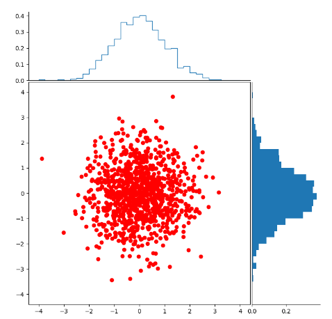
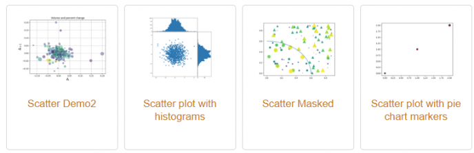
一个简单的组合图绘制好了,更多绘图姿势请参考文章。
参考文章:
1.https://matplotlib.org/gallery/index.html
