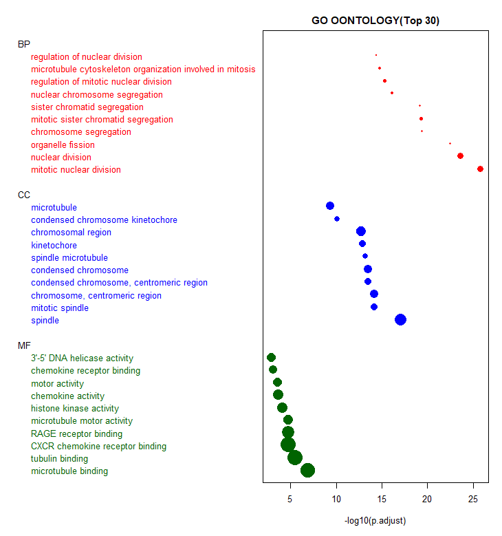
GO分析,主要涉及“BP”、“CC”、“MF”,常规绘图有柱状图、散点图等,今天给大家用R展示带分组标签的散点图,整体显示更加直观:
# 加载包,这种情况Y叔的包少不了,感觉成了富集分析的标配了
library(clusterProfiler)

data(geneList, package = "DOSE")

# 获取演示数据
gene <- names(geneList)[1:100]
go <-
  enrichGO(gene, 'org.Hs.eg.db', ont = "ALL", pvalueCutoff = 0.01)
head(go)

# 给三种GO类型赋不同的颜色
result <- go@result
result$color <- "red"
result[result$ONTOLOGY == "BP", ]$color <- "red"
result[result$ONTOLOGY == "CC", ]$color <- "blue"
result[result$ONTOLOGY == "MF", ]$color <- "darkgreen"


# 取Top30合并
result <- rbind(result[result$ONTOLOGY == "BP", ][1:10,],
                result[result$ONTOLOGY == "CC", ][1:10,],
                result[result$ONTOLOGY == "MF", ][1:10,])


# 绘图
dotchart(
  -log10(result$p.adjust),
  labels = result$Description,
  cex = .8,
  pt.cex = result$Count*.1,
  groups = result$ONTOLOGY,
  # lcolor = "white",
  main = "GO OONTOLOGY(Top 30)",
  xlab = "-log10(p.adjust)",
  gcolor = "black",
  pch = 19,
  color = result$color
)
最终结果如下:
参考资料:
1.https://www.statmethods.net/graphs/dot.html
