小提琴图 (Violin Plot) 用于显示数据分布及其概率密度的组合图,结合了箱形图和密度图的特征,主要用来显示数据的分布形状。
对于小提琴的绘制在R中用ggplot2比较常见,也非常简单,下面简单演示如何用R绘制小提琴图,首先我们定义一个演示数据结构:
library(ggplot2)
library(ggthemes)
# 演示数据,定义四个时间点
Time <-
rep(c("Time1", "Time2", "Time3", "Time4"), each = 100)
# 每个时间点定义2个分组
Type <-
c(
rep("N", 50),
rep("T", 50),
rep("N", 50),
rep("T", 50),
rep("N", 50),
rep("T", 50),
rep("N", 50),
rep("T", 50)
)
# 随机赋值
value <- c(rnorm(400))
# 生成数据框
Data <-
data.frame(Time = Time,
Type = Type,
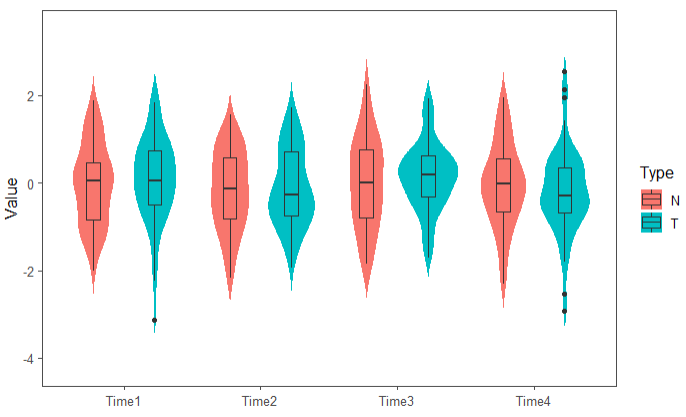
value = value)下面用ggplot2绘制2组、4个时间点小提琴图:
ggplot(Data, aes(x = Time, y = value, fill = Type)) +
    geom_violin(trim = FALSE, color = "white") + # 绘制小提琴图
    geom_boxplot(width = 0.2, position = position_dodge(0.9)) + #绘制箱线图
    theme_few() +
    ylab("Value") + xlab("") #设置x轴和y轴的标题
也可以绘制四个时间点的小提琴图(此处fill改成用Time填充):
ggplot(Data, aes(x = Time, y = value, fill = Time)) +
    geom_violin(trim = F, color = "white") + # 绘制小提琴图
    geom_boxplot(width = 0.2, position = position_dodge(0.9)) + #绘制箱线图
    theme_few() +
    ylab("Value") + xlab("") #设置x轴和y轴的标题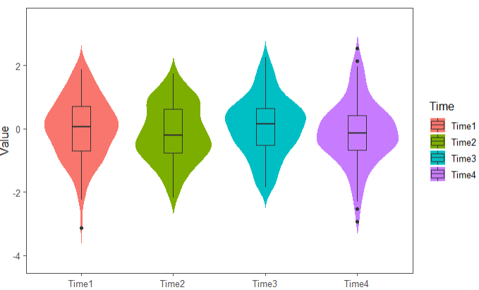
总体来说用ggplot2绘制很方便,建议大家亲自动手尝试,也可以参考下面博文,介绍也很详细。
参考资料:
1.https://blog.csdn.net/zhouhucheng00/article/details/86082760
