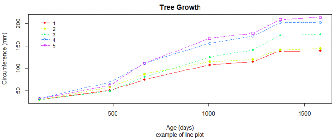
折线图是很常见的文章绘图,本文旨在通过一个简单的实例教大家如何绘制文献中常用的折线图,利用R内置的plot函数绘制,示例如下:
# 创建演示数据

# 为方便起见,将因子转换为数值
Orange$Tree <- as.numeric(Orange$Tree)
ntrees <- max(Orange$Tree)

# 得到x和y轴的范围
xrange <- range(Orange$age)
yrange <- range(Orange$circumference)

# 绘图
plot(xrange,
     yrange,
     type = "n",
     xlab = "Age (days)",
     ylab = "Circumference (mm)")


# 添加线的元素
colors <- rainbow(ntrees)
linetype <- c(1:ntrees)
plotchar <- seq(18, 18 + ntrees, 1)
# 图上添加不同的线
for (i in 1:ntrees) {
  tree <- subset(Orange, Tree == i)
  lines(
    tree$age,
    tree$circumference,
    type = "b",
    lwd = 1.5,
    lty = linetype[i],
    col = colors[i],
    pch = plotchar[i]
  )
}

# 添加标题和子标题
title("Tree Growth", "example of line plot")

# 添加左侧图例
legend(
  xrange[1],
  yrange[2],
  1:ntrees,
  cex = 0.8,
  col = colors,
  pch = plotchar,
  lty = linetype,
  #title = "Tree",
  # 在图例周围绘制的框的类型
  bty = "n",
  #box.col = "white"
)
参考资料:
1.https://www.statmethods.net/graphs/line.html
